Creative Visual Merchandising on Display at Spring Fair 2020
)
We can’t believe Spring Fair was over a month ago! That however has not stopped us thinking about all the new and diverse range of exhibitors and products on display across the 2020 offering.
The Spring Fair team want to continue to celebrate the creative techniques used by our exhibitors, so we’ve enlisted the help of two of the show’s speakers who featured in the Retail Skills Theatre. When they weren’t busy sharing valuable visual merchandising insight with our visitors at the show, expert Visual Merchandisers Clare Harvey and Cigie Florent from leading retail design company TRC, were able to walk the show floor, cast their expert eyes on stands around the show and pick out their favourites.
Below is a selection of Clare and Cigie’s favourite stands and some words on what they liked about them:
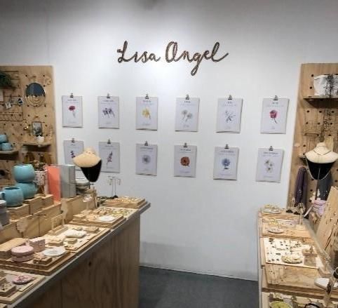
Lisa Angel
Product Type: Jewellery, Fashion and Homewares
What worked well: The back walls have been merchandised very well and they are coordinated into a great cohesive story. All jewellery has been merchandised by them and clearly priced.
What was different: The simple eye-catching clipboards on the back wall help to draw the customer in creating a visual break.
Overall: The natural wooden shop fit was consistent and very effective against the white background and the overall look and feel was very welcoming and exciting.
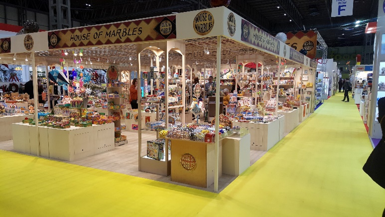
House of Marbles
Product Type: Toys, Play & Tech
What worked well: The colour of the stand was a warm cream colour, this paired with warm lighting made it feel very inviting.
What was different: The stand had a low open lattice effect celling which gave the stand an intimate feel without feeling claustrophobic.
Overall: The animated elements along with the carefully thought through displays led to a well-executed and attractive stand.
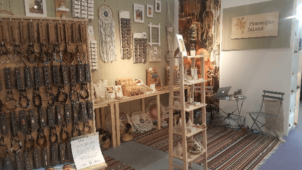
Pineapple Island
Product Type: Fashion, Jewellery & Watch and Gift
What worked well: They used the space really well without it feeling cluttered.
What was different: We loved the bespoke jewellery stands!
Overall: The look and feel of the stand complimented the products well and it had a really considered and coherent theme running throughout.
Other notable mentions:
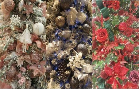
SI Swift Imports: The way that the numerous Christmas trees on the stands has been colour blocked was a really effective way of creating eye-catching displays.
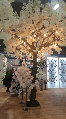
Lotus Imports Ltd: We liked the way that large trees had been used as a centre piece to this stand, they were really visible as you walked into the hall and were drawing people towards the stand.
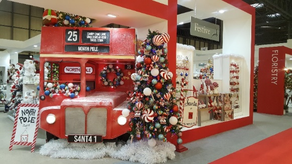
Festive: We saw lots of stands using interactive elements to draw the buyers in. Festive had lots of big and bold displays that were eye catching and combined with interactive elements such as a sleigh photobooth and popcorn machine that fit perfectly into their ‘Christmas carnival’ theme.
)
)
)
)
)
)
)
)
)
)
)
)
)
)
)
)
)
)
)
)
)
)
)
)
)
)
)